Home decoration is an expression of personal taste and style. Appropriate color selection can increase the energy of the space and create a peaceful environment. In this article, we will discover how to achieve color harmony in home decoration.
Color Theory Basics
Color theory is a fundamental concept in the world of art and design. Colors can have a profound effect on human emotions and completely change the atmosphere of a space. Color theory in home decoration is the key to creating a harmonious and aesthetic environment.
Basic Colors
Red: It is the color of power and passion. It increases energy and attracts attention.
Blue: It has a relaxing effect on people because it represents calmness and coolness.
Yellow: It is the color of joy and vitality. It gives a feeling of brightness and warmth.
These three colors form the basis of all other colors and are mixed together to create secondary colors.
Secondary Colors
Green: It is a mixture of blue and yellow. It symbolizes naturalness and freshness.
Orange: It is the combination of red and yellow. It gives warmth and energy.
Purple: It is a mixture of red and blue. It represents luxury and creativity.
Psychological Effect of Colors
Blue: Gives a feeling of tranquility and efficiency, so it is often used in offices and work spaces.
Yellow: Refreshing and eye-catching, but overuse can cause eye fatigue.
Red: Energetic and exciting, but overuse can create restlessness.
Color Harmony and Balance
Color harmony is about understanding how different colors work together. Color harmony increases the integrity and visual appeal of the space. Some common methods for this are:
Analog Colors: The use of colors close to each other on the color wheel has a soothing effect on the person.
Complementary Colors: Can be used to create a dynamic and vibrant effect.
Triadic Scheme: Use of three colors equally spaced on the color wheel. Provides a balanced and vibrant look.
Color Temperature
The temperature levels of colors affect the atmosphere of the place:
Warm Colours: Colors such as red, yellow and orange create a friendly effect in the environment.
Cool Colours: Colors such as blue, green and purple increase the feeling of serenity and calmness of the environment.
Color theory provides guidance on how to combine colors used in home decoration and what atmosphere they will add to the space. Understanding the power of color is key to transforming your home and creating the emotional impact you want.
The Importance of Color Matching
Color harmony is one of the most important elements of home decoration and deeply affects the visual and emotional effects of the space. The harmony of colors with each other determines the general atmosphere and perception of the space. The use of harmonious colors makes the space look more balanced and aesthetically appealing, while also allowing the eye to navigate the space comfortably. This is especially important for large, open spaces where visual transitions must be smooth and fluid.
Colors also have powerful psychological effects. Color choices made in home decoration play a major role in creating the desired emotional effect in the space. Harmonious color palettes bring together these emotional responses in a balanced way, creating a feeling of comfort and peace in the space. In contrast, clashing colors can subconsciously create unrest and discomfort.
In addition, color harmony also affects the functionality of the space. The interaction of colors with light creates different shadow and depth effects in the space, which enriches the visual perception of the space.
Color Schemes and Combinations
Color schemes are the basis for creating a harmonious look in home decoration. Different color combinations add an individual touch to the decoration, determining the atmosphere and character of the space. Here is a detailed look at some popular color schemes that can be used in home decoration and how these schemes can be used effectively:
Monochromatic Color Scheme
A monochromatic scheme is created by using a single color hue with varying levels of saturation and lightness. This scheme creates an air of simplicity and sophistication. In a monochromatic environment, although a single color may dominate, the use of different tones and textures helps add depth and interest. For example, a blue monochromatic scheme can be richly layered by using sky blue walls, teal sofas and light blue accessories. This scheme is especially ideal for modern and minimalist decorations.
Analog Color Scheme
An analog color scheme is created by using colors that are close to each other on the color wheel. This scheme creates a natural and harmonious look. For example, an analog scheme consisting of shades of green and blue offers a calm and relaxing atmosphere. This type of scheme is particularly suitable for use in nature-themed or pastoral decorations. In the analog scheme, the transitions between colors are soft and fluid, creating a visually soothing effect.
Complementary Color Scheme
A complementary color scheme combines colors that are opposite each other on the color wheel. This creates a lively and energetic atmosphere. For example, complementary colors such as blue and orange add dynamism and liveliness to the space. This scheme is especially suitable for those who want an energetic and bold decoration style. When using complementary colors, it is important to balance the intensity of the colors. Too many bright colors can be tiring on the eyes, so it’s helpful to adjust the saturation of the colors and balance them with neutral tones.
Triangle Color Scheme
The triangular color scheme involves using three colors that are evenly spaced on the color wheel. This scheme adds a dynamic and colorful look to the space. For example, a triangular scheme such as red, blue and yellow adds energy and liveliness to the space. A triangular color scheme can be used in spaces that aim to create a fun and creative atmosphere. In the triangular scheme, it is important to maintain balance between colors and ensure that each color is felt with equal weight in the space.
Color Applications: Color applications play a vital role in home decoration. How colors are used greatly affects the character and feel of the space. Colors can be used effectively in every corner of the house, from walls to furniture, from accessories to lighting.
Here are the different aspects of color applications in home decoration:
Wall Colors
Walls are one of the most important elements that determine the visual tone of the space. Color selection can affect the space, brightness and overall atmosphere of the space. Wall color also helps decorative elements to stand out, making furniture and accessories stand out.
Furniture and Accessories
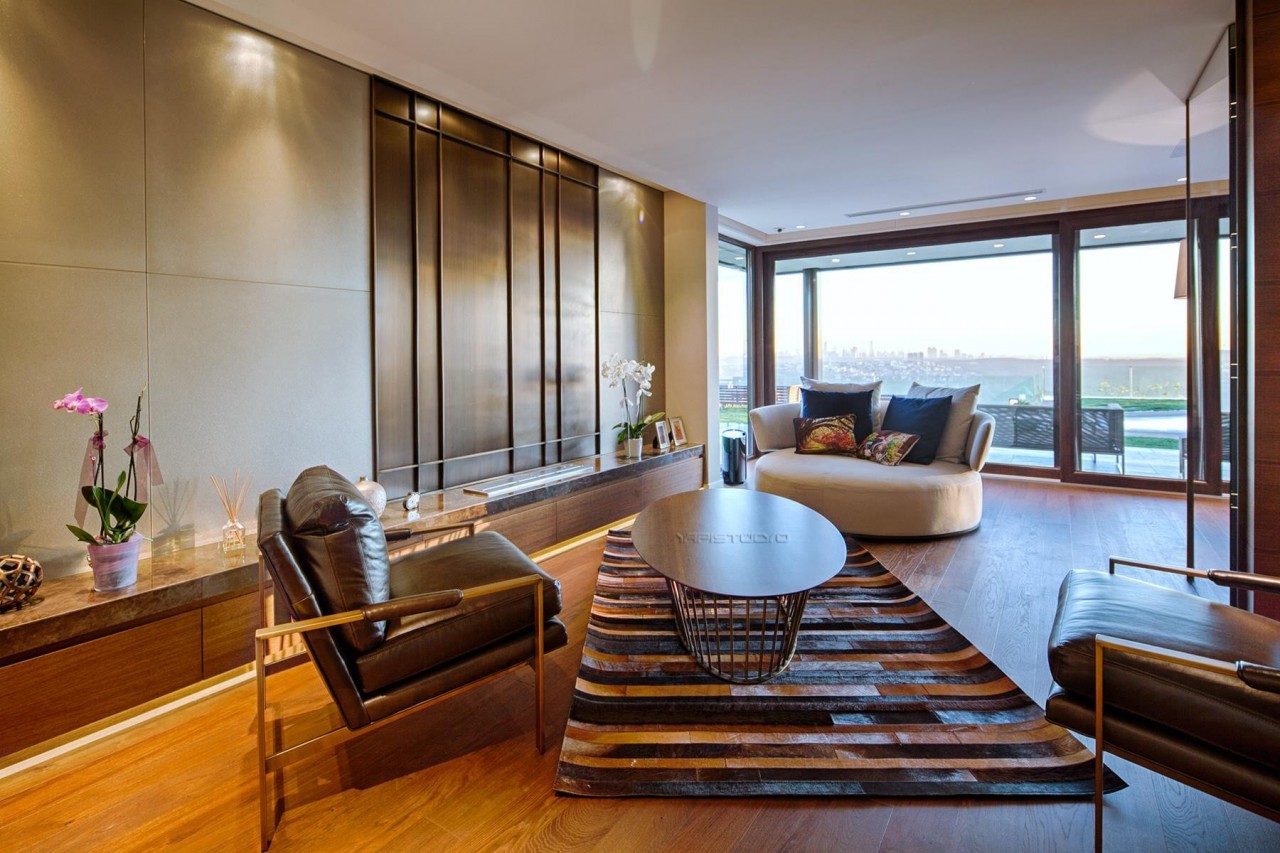
Furniture and accessories serve as complementary elements of the color scheme. Colorful furniture can add character and liveliness to a space. For example, in a room with neutral tones, a colorful armchair or sofa can create a focal point and increase the energy of the space. Accessories enrich the color scheme through pillows, curtains, paintings, carpets and decorative objects. These elements add depth and texture to the space, accentuating the color scheme.
Lighting
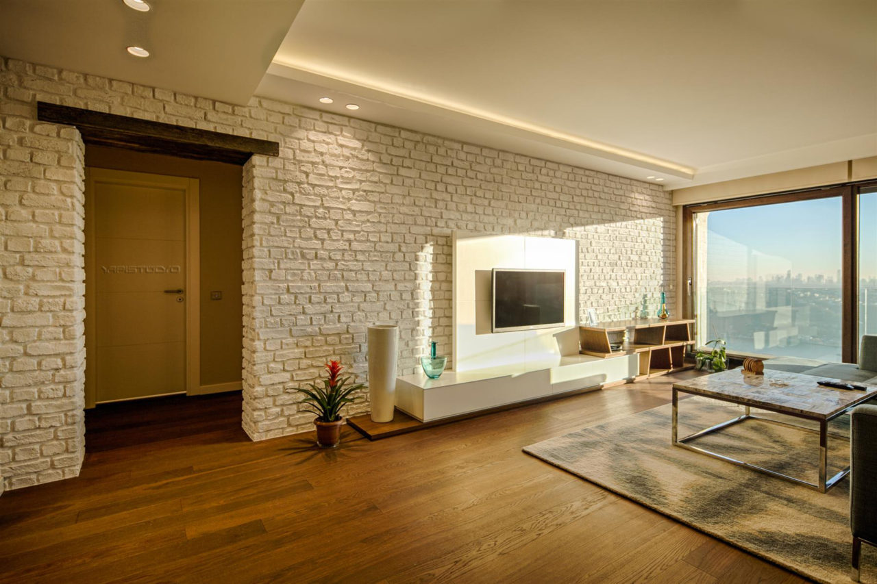
Lighting greatly affects how colors are perceived. While natural light makes colors appear more vivid and realistic, artificial light can change the tone of colors. For example, warm white lights make colors appear warmer and more inviting, while cool white lights make colors appear clearer and more vibrant. Lighting is also important in highlighting certain colors and illuminating different areas of the space.
Color and Texture
In addition to colors, textures are also an important element that affects the atmosphere of the place. Different textures can change the perception of colors and add variety to the space. For example, glossy surfaces make colors appear more vibrant, while matte surfaces offer a softer and more natural appearance. The use of various materials such as fabric, wood, metal and glass, together with colors, adds richness and variety to the space.
Color harmony in home decoration is one of the most important factors that determine the aesthetics and atmosphere of the space. Colors deeply affect not only the appearance of the space, but also the emotional feeling of the environment. Drawing on the foundations of color theory, creating harmonious color schemes and combinations enriches the space both visually and emotionally. The correct use of colors in every area, from walls to furniture, from accessories to lighting, reveals the character of the space and reflects personal tastes. As a result, ensuring color harmony in home decoration increases the integrity, functionality and aesthetic value of the space, making our living spaces more inviting, comfortable and inspiring. This is one of the most important steps to take in the home decorating journey and is the key to transforming the house into a true home, as well as improving the overall atmosphere of the place.